


Old Friends, New House
When old friends Brandon and Julie approached me to help design their new home build, I was so excited! They've been big fans of our stores, and live in one of my favorite neighborhoods — Westwood, KS — just walking distance from my design firm office. I already knew three things about their design tastes: they love modern, moody, and luxe. My challenge was to make sure that we kept those connected and balanced. While each project is unique, I always try to think about the lifestyle of our clients and focus on how the space needs to feel in order to bring or maintain balance to their lives. For most of us, life outside of the home is a little hectic and can often be chaotic. This pushes me to design spaces that feel like a retreat — a place to catch your breath, relax, unwind, and just enjoy being at home.
I'm excited to share some of the highlights of this project through photos taken by our friend and professional interior design photographer, Matthew Anderson.
Living and Dining
When you first walk in through the modern iron and glass door, you're welcomed by the adjoining living and dining room. We wanted to balance out all of the rectangular elements with a round dining table and chandelier. I often design floating elements with cabinets, bars, buffets, and vanities to keep the floor space uninterrupted. When considering the buffet, I knew right away that I wanted to keep the modern open vibe by having it mounted on the wall with soft lighting underneath to emphasize that it was floating.

I discussed the use of the buffet with Brandon and Julie, and determined that they would benefit from having Dekton as the top surface. Dekton costs a little more than quartz, but it is fire resistant, stain resistant, and scratch resistant. That means you can bring your hot serving dishes or pots and pans over from the kitchen to be right near the dining table. Also, their son can run his toy cars across the top of it when Mom and Dad aren't looking — with no trails of scratches left behind!

When it came to the living room, I started with considering the fireplace design as it would be a focal point for the space. We knew we wanted something that complemented the modern essence of the room, while maintaining a timeless look. Fireplaces can be costly to renovate, so keeping them timeless is important for most projects. With this in mind, we chose a classic and minimal transitional concrete fireplace mantel design, leaving space above for an art TV. We love to use art TV's where clients want to be able to have the option of watching TV or having it look like art depending on the changing needs for the space. Soft, quiet textiles juxtapose the concrete and keep the room serene, with added interest from the light fixture that has great architectural lines.
Kitchen & Bar
With the living room being bright and airy, I thought it was a great opportunity to add some drama with a dark and moody kitchen. We chose a combination of Silestone Et Noir for the island, range hood cover, and bar...and Dekton Sirius for the countertops and backsplash, and then painted the surrounding uncovered walls in Sherwin Williams Tricorn Black to give the dark background a seamless look. Putting Dekton on the countertops right next to the cooktop allows hot pots and pans to be taken directly off the stove and moved aside without the need for hot pads since it's designed to be in direct contact with heat.

One of the ways I create a calming space is to remove visual noise. This is a big reason I often opt out of a tile backsplash, and instead continue the countertop material up the wall. This allows the focus to be on the drama of the dark and light cabinets and the juxtaposition of the rustic and clean textures. The island light fixtures are strategically placed to not intersect with the cabinets when looking directly at the kitchen from the living room.
We continued the dark and moody drama over at the adjoining wet bar, where custom brass and glass shelves set the stage for Brandon's curated collection of spirits where he has libation options for everyone's taste! To continue the the theme of removing visual noise, we chose panel ready appliances and covered them with materials that match the cabinets, eliminating those giant stainless steel rectangles from the visual equation.

Powder Bath
This smaller space is harder to photograph, but I wanted to show a few features we are proud of. I'm not usually a big fan of overhead vanity lighting. It's just not flattering as it tends to cast shadows on your face. Here, we used a hanging modern ring light fixture to directly illuminate your face while making sure you are looking top notch at Brandon and Julie's cocktail party!

We continued the Dekton countertop material up 20 inces to create a minimal backsplash that will nicely support the wall mounted, gold Litze faucet by Brizo (my go-to faucet brand). I love the touch of glam that the black crystal knob adds. I've often seen wall mounted faucets fail over time when applied directly to drywall and sometimes even with tile that has aging grout. This application of materials should support the wall mounted faucet for years to come.
Upper Level Hallway
After Brandon & Julie settled in, we decided to revisit the home and see if there were any ancillary spaces that could use some added texture or design elements. With the surrounding bedrooms having mostly white walls, we decided it would feel more balanced to warm up the hallway with rich textures. We amplified the luxe vibes with Schumacher's Haiku Sisal in Taupe on the walls, and adorned the ceiling with a complimentary metallic, geometric pattern called Dorado by Weitzner. This really added visual interest and sophistication to what was an otherwise understated space.

Primary Bedroom
This room stayed quiet and neutral, with a few pieces of contrast. The soft off-white headboard gently blends into the wall to help minimize the repeated rectangular shapes of the windows on either side. A petite loveseat sits at the end of the bed, facing the art TV above their dresser, making great functional use of the space. A round, elegant chandelier complements the rectangular ceiling feature.
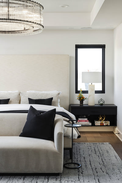
As an alternative to ready made furniture, we chose to create custom, floating single-drawer nightstands with open cubbies for books and magazines, featuring soft, under-mounted mood lighting. Again, we used Dekton as the tops. They'll never have to worry about scratching or leaving drink rings on these bedside pieces, and having them float just adds to the feeling of spaciousness by showing the floor underneath them.
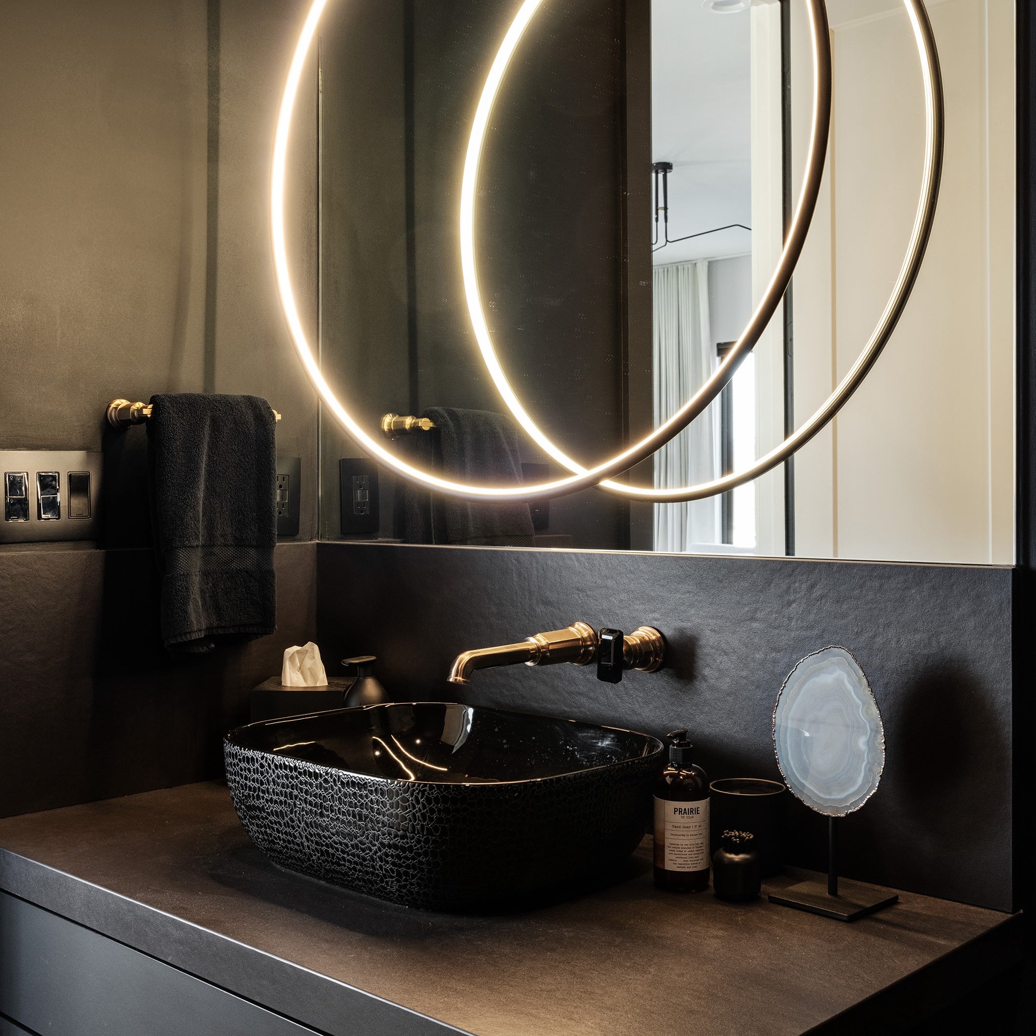
Primary Bathroom
When it came to design the primary bathroom, we really wanted to play off contrast, mood, and the use of natural light. We created an open wet area for showering, making use of the tall vertical privacy windows to let natural light flood in. This is a large bathroom that would be costly to change, so we decided to marry timeless tile selections with modern cabinets and fixtures. A heated floor in matte-black, textured anti-slip hexagon mosaic adds drama and contrast against the classic marble wall tiles applied in a straight-lay pattern. We angled the matte black freestanding tub for added interest and a casual feel.

When it came to lighting, we wanted to make the most of function while honoring the moodiness, so we opted out of the traditional use of vanity lights above the mirrors and instead chose lighted mirrors paired with moody sconces. This allows for a soft illumination on the mirror walls when the mirrors aren't in use.
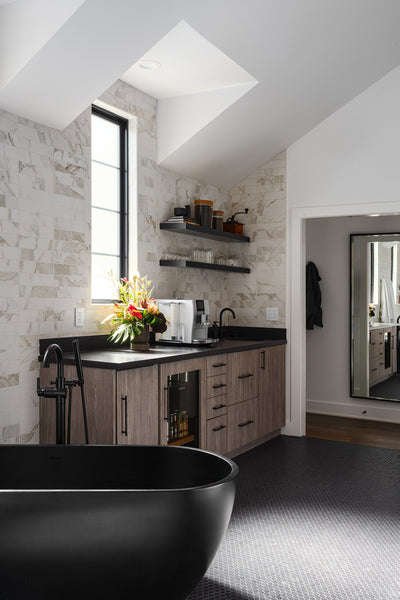
Luxury meets function with a fully stocked coffee bar integrated into the primary bathroom. What a seamless way to get up and going every morning! The coffee bar includes refrigeration, and a bar sink with a built in draining glass rinser usually seen in coffee shops. Other features not seen include a matching makeup vanity station, and built in filtered water bottle filler. No more going up and down the stairs just to get your coffee, tea, or filtered drinking water!
Basement TV Room
This room is designed for gathering and watching movies, so comfort and function are key. We kept the room dark with black walls and ceiling so that the on-screen entertainment becomes the focal point. A large Cloud sectional in soft black upholstery adds modern comfort for several people with plenty of room to spread out. The glimmering glow of the edison bulb sconces adds a timeless touch of moody nostalgia, and are easy on the eyes after watching a movie in the dark.

Basement Office
This is another small space that is hard to photograph. This was originally a narrow, white box of a space set aside for home office use. Little did they know how much they'd actually be using the office space after new COVID work-from-home trends were established. To help the small space feel as big as possible, I added dark smoky mirror to the wall that they face when sitting in their chairs. This tricks your brain into thinking there is space beyond the wall (an old trick we have all seen in restaurants for years). Also, there's a myth that a white room feels bigger than a dark room. This is not an absolute truth, and really depends on the space. Generally, dark colors recede, and lighter walls come into the foreground. That's why we went dark with Zinc's Maurier Charcoal wall covering in this small, confined space. It allows your mind's eye to rest, as opposed to being constantly aware that there's a bright white wall 20 inches from your face while looking at your monitor.

Love our Work? Let Us Help You Dress Your Habitat!
We hope you've enjoyed taking a look at one of our recently finished new construction interior design projects. We felt this project showcased many of the ways we work with our clients to make the most of their esthetic tastes and functional needs by using design principles that are relevant to the ways we are living our lives today. If you're interested in having us help you Dress Your Habitat, fill out our interior design questionnaire and a member of our team will connect with you to schedule a free home visit and design consultation!
Cheers,
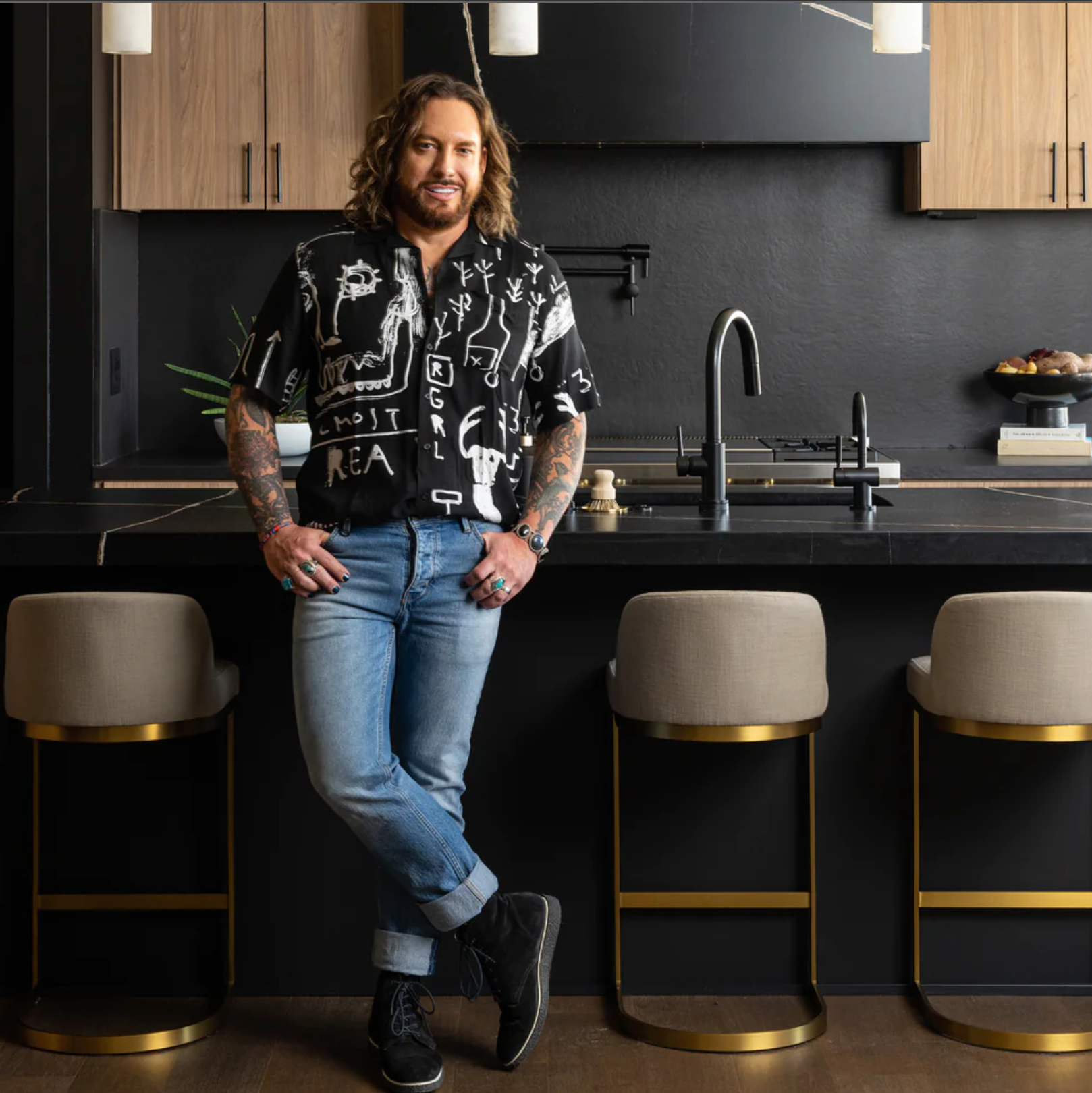
Buck Wimberly and the ULAH Interiors + Design Team
Credits: Portrait Photography by Jenny Wheat, Interior Photography by Matthew Anderson, Floral Arrangements by Fiddly Fig